Let’s address the elephant in the room. If you read the comments on my articles or browse the iOS subreddits, there is a vocal contingent of developers betting that Apple is going to roll back Liquid Glass.
The rationale usually points to the initial community backlash, the slower adoption rate of iOS 26, and the news that Alan Dye left Apple for Meta. The prevailing theory has been: “Just wait it out. They’ll revert to flat design.”
I shared this exact sentiment with the Apple team.
Their reaction? Genuine shock. They were actually concerned that developers were holding onto this position. They made it emphatically clear that Liquid Glass is absolutely moving forward, evolving, and expanding across the ecosystem.
Unsurprising. Though I expect a number of people reading this will be disappointed, I cannot imagine a world in which Apple would either revert to its previous design language or whip together something new. It is going to ride Liquid Glass and evolve it for a long time; if history is a good rule of thumb, assume ten years.
In theory, this is a good thing. Even on MacOS, I can find things I prefer to its predecessor, though admittedly they are few and far between. This visual design feels much more at home on iOS. The things that cause me far more frustration on a daily basis are the unrelenting bugs across Apple’s ecosystem, like how I just finished listening to an album with my headphones and then, when I clicked “play” on a new album, Music on MacOS decided it should AirPlay to my television instead of continuing through my headphones. That kind of stuff.
Regardless of whatever one thinks the visual qualities of Liquid Glass, the software quality problem is notable there, too. We are now on the OS 26.4 set of releases and I am still running into plenty of instances with bizarre and distracting compositing problems. On my iPhone, the gradients that are supposed to help with legibility in the status bar and toolbar appear, disappear, and change colour with seemingly little relevance to what is underneath them. Notification Centre remains illegible until it is fully pulled down. Plus, I still see the kinds of graphics bugs and Auto Layout problems I have seen for a decade.
I hope to see a more fully considered version of the Liquid Glass design language at WWDC this year, and not merely from a visual perspective. This user interface is software, just like dedicated applications, and it is chockablock full of bugs.
Bolella, emphasis mine:
I plan to share an article soon where I break down the exact physics, z-axis rules, and “Barbell Layouts” of this hierarchy. But the high-level takeaway from the NYC labs is crystal clear: maximize your content, push your controls to the poles, and never let the interface compete with the information.
In a WWDC 2011 session, Dan Schimpf explained some of the goals of the refreshed design for Aqua in Mac OS X Lion were “meant to focus the user attention on the active window content”. This sentiment was echoed by John Siracusa in his review of Lion for Ars Technica:
Apple says that its goal with the Lion user interface was to highlight content by de-emphasizing the surrounding user interface elements.
[…] a fresh modern look where controls are clearer, smarter and easier to understand, and streamlined toolbars put the focus on your content without compromising functionality.
Then, when it revealed the Big Sur redesign in 2020, it explained:
The entire experience feels more focused, fresh, and familiar, reducing visual complexity and bringing users’ content front and centre.
And you will never guess what it promised in 2025 with the announcement of MacOS Tahoe and Liquid Glass, as introduced by Alan Dye:
Our goal is a beautiful new design that brings joy and delight to every user experience. One that’s more personal, and puts greater focus on your content — all while still feeling instantly familiar.
It is not just Apple, either. Here is Microsoft’s Jensen Harris at Build 2011 describing a key goal for the company’s then-new Metro design language:
Metro-style apps have room to breathe. They’re not about the chrome, they’re about the content. […] For years, Windows was always about adding stuff. We added bars, and panes, and doodads, and widgets, and gadgets, and bars — and stuff everywhere. And that’s how we defined our U.I., based on what new widgets we added. Now, we’ve receded into the background, and the app is sitting out there on the stage.
And later, as Microsoft rolled out app updates with its Fluent Design language, it described them in familiar terms:
With the updated OneDrive, your content takes center stage. The improved visual design reduces clutter and distractions, allowing you to focus on what’s important – your content.
This is a laudable goal if the opposite is, I assume, increasing the amount of clutter in user interfaces and making them more distracting. Nobody wants that. Then again, while the objective may be quite reasonable, there are surely different ways of achieving it — but Apple has embraced a single strategy: make the interface blend into the document. (I will be focusing on MacOS here as it is the platform I am most familiar with.)
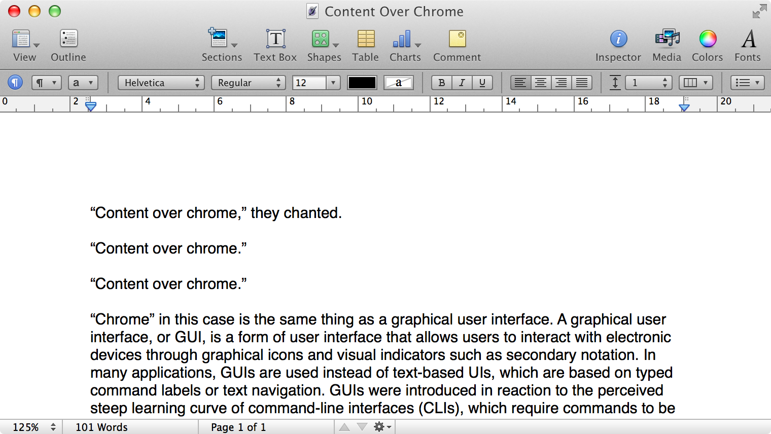
Here is what a Pages document looks like running under Mac OS X Lion:
Click to expand (except on mobile).
Here is that same document in a newer version of Pages running on MacOS Catalina, with the Yosemite-era design language that replaced the one that came before:
Click to expand (except on mobile).
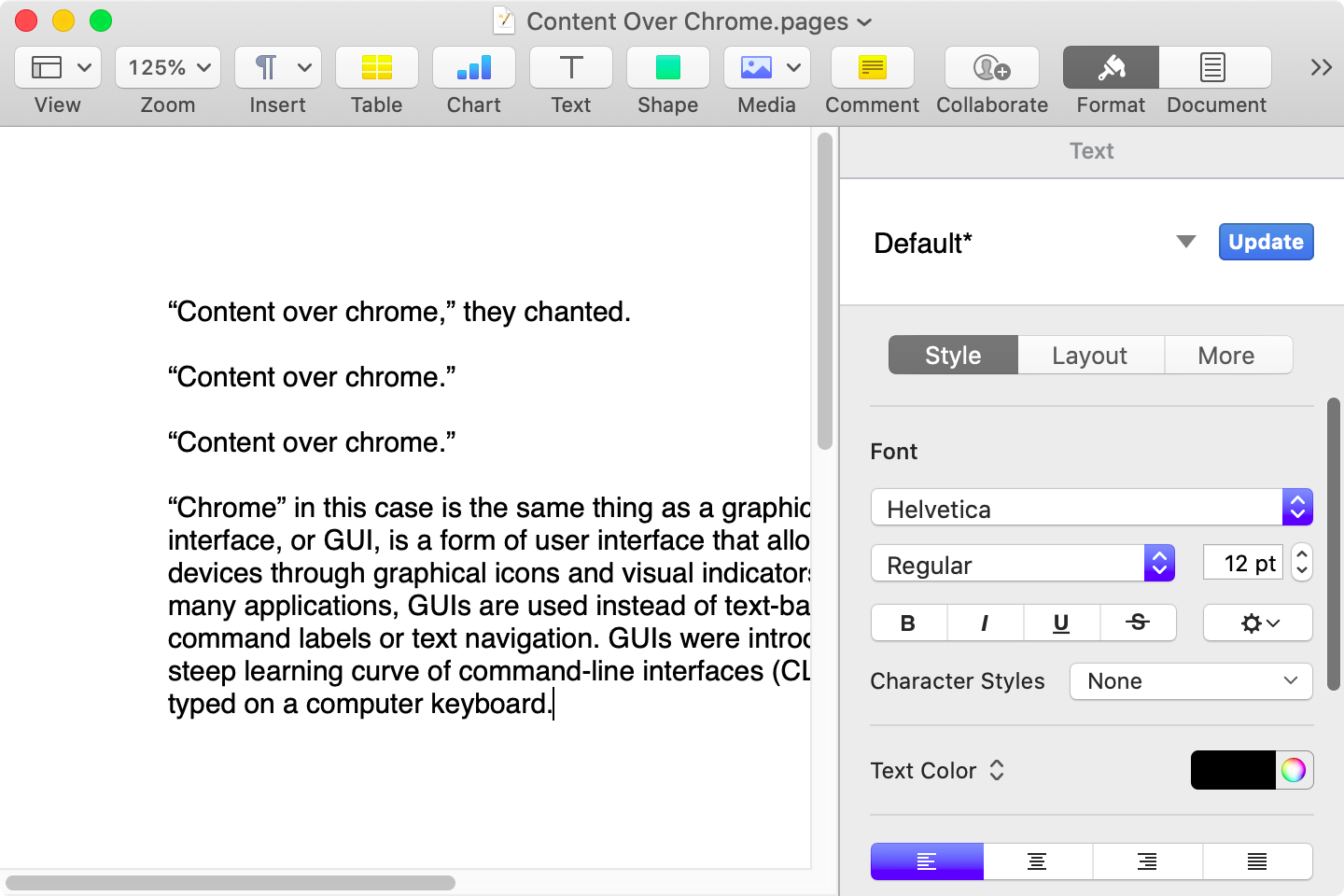
Here it is in the last version of Pages on MacOS Tahoe, using the design language introduced with Big Sur:
Click to expand (except on mobile).
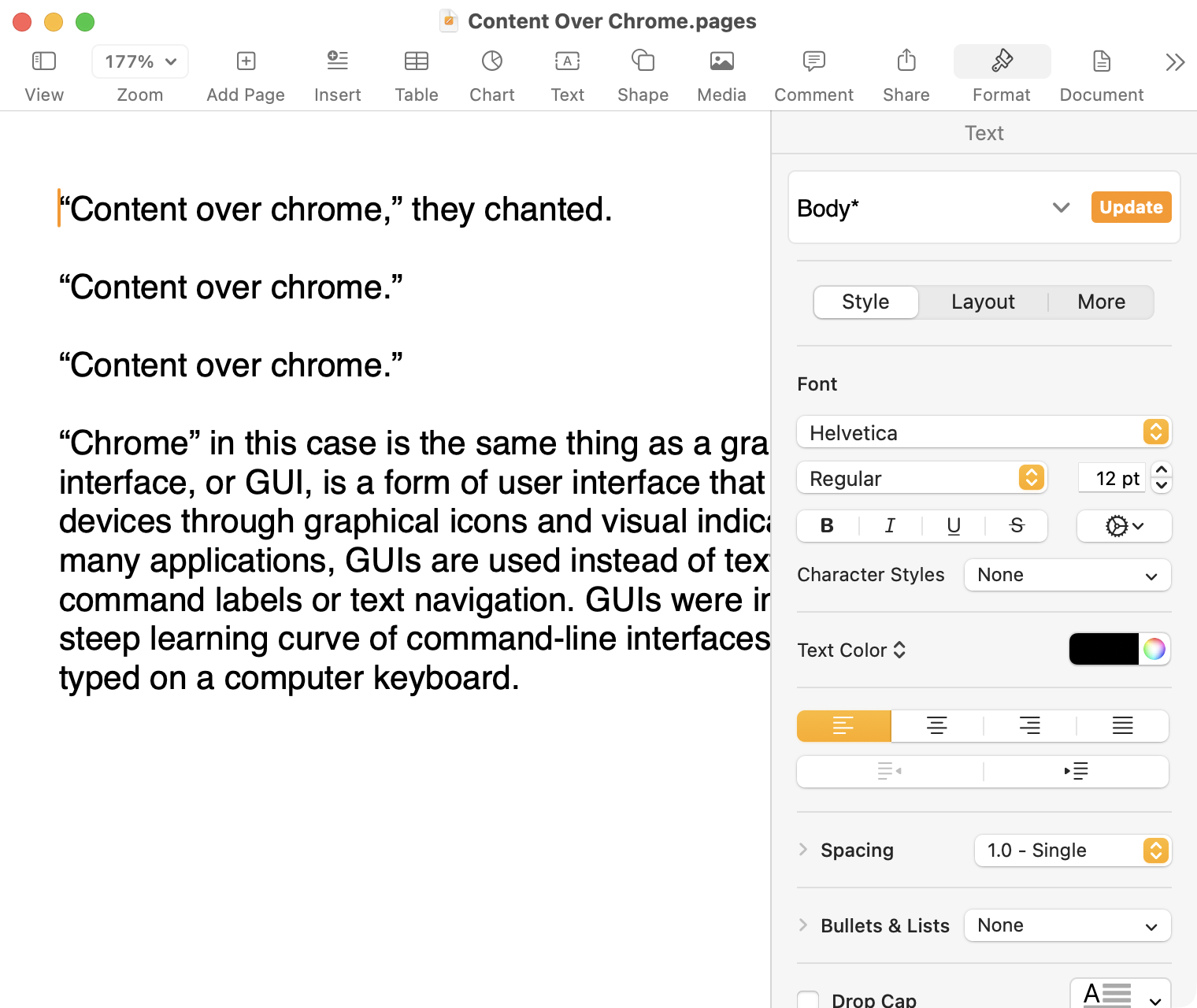
And, finally, the newest version of Pages on MacOS Tahoe using the current Liquid Glass visual design language:
Click to expand (except on mobile).
There are welcome improvements in newer versions of this comparison, like the introduction of the “Format” panel on the right-hand side, which makes better use of widescreen landscape-oriented displays, and allows for larger controls. While I admire the density of the Lion-era screenshot, the mini-sized controls in that formatting menu are harder to click.1
Overall, however, what Apple has done to Pages over this period of time is representative of a broader trend of minimizing the delineation of user interface elements from each other and the document itself. This is the only tool in the toolbox, and I am skeptical it achieves what Apple intends.
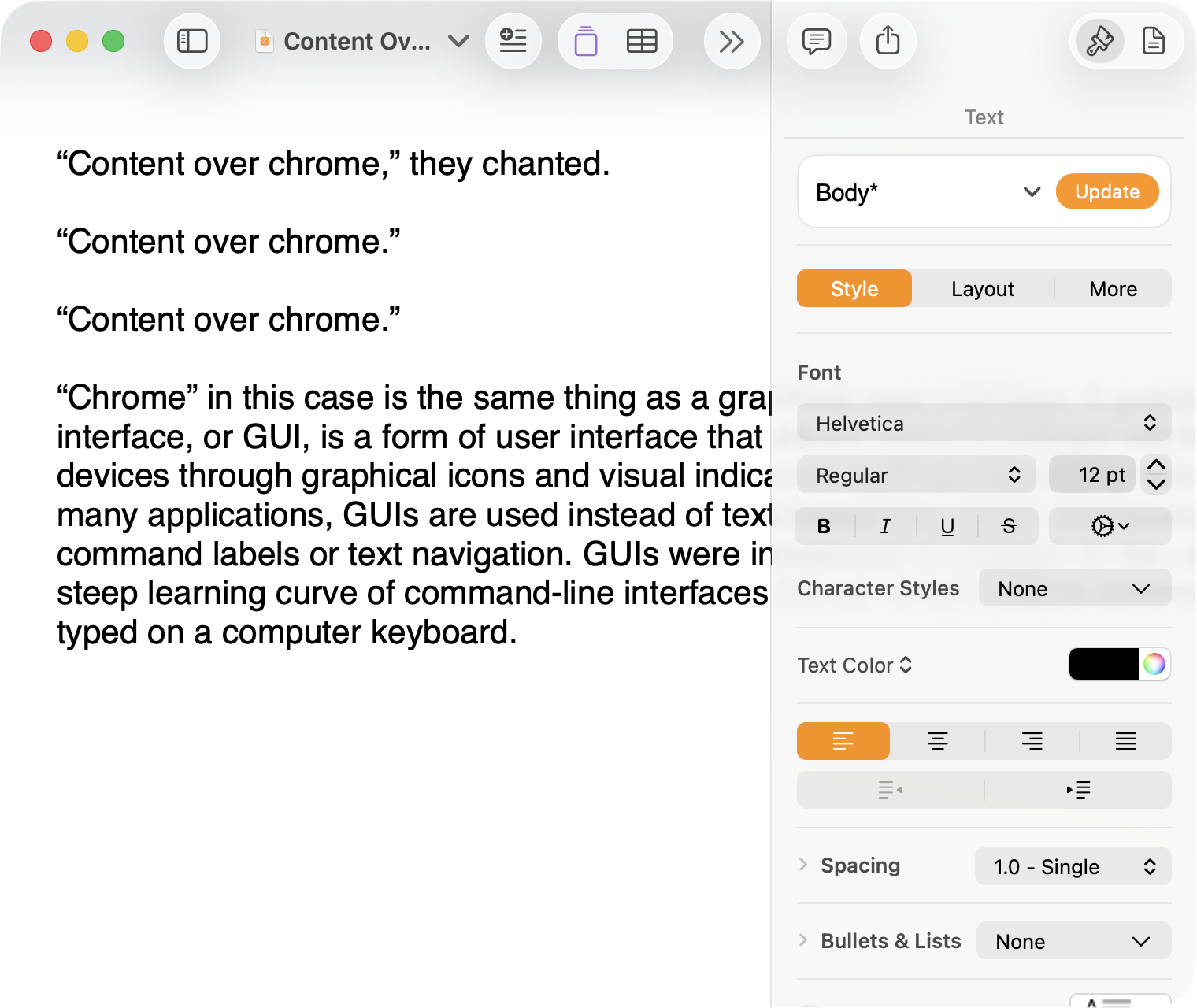
Compare again the two more recent screenshots against the ones that came before, and focus on the toolbar at the top of each. In the older two, there is a well-defined separation between the toolbar — the window itself — and the document. In the Big Sur visual language, however, the toolbar is the same bright white as the document. By Tahoe and the Liquid Glass language, there is barely a distinction; the buttons simply float over the document. And, bizarrely, that degrades further with the “Reduce Transparency” accessibility preference enabled:
Click to expand (except on mobile).
(Also, no, your eyes do not deceive you: the icons in the drop cap menu, barely visible in the lower-right, are indeed pixellated.)
For me, this means a constant distraction from my document because the whole window has a similar visual language. As the toolbar and its buttons become one with the document, they lose their ability to fade into the background. In the two older examples, the contrast of the well-defined toolbar allows me to treat them as an entirely separate thing I do not need to pay attention to.
This is further justified by the lower contrast within those two older toolbars. In Lion, the grey background and moderately saturated colours are a quiet reminder of tools that are available without them being intrusive. The mix of shapes is a sufficient differentiator, something Apple threw away in the following screenshot. By making all the buttons literal and with the same bright background, the toolbar becomes a little more distracting — but at least it does not blend into the document. Without the context of the previous screenshot, the colours of each icon seem almost random, and I find the yellow-on-white “Table” button difficult to distinguish at a glance from the black-on-yellow-on-white “Comment” button.
The Big Sur-era design language is, frankly, an atrocious regression. The heterogeneous shapes may have returned, but in the form of monochromatic medium-grey icons set against a uniform white background. The icons are not bad, per se — though putting “Add Page” and “Insert” next to each other in this default toolbar layout, both represented by a plus sign, is a little confusing. But I will bet you would not guess that some of these are buttons, while others are pop-up buttons with a submenu.
Finally, there is Liquid Glass which, in its default form, has more contrast than the previous example; with “Reduce Transparency” enabled, which is how I use MacOS, it has even less. The buttons themselves have a greater amount of internal contrast with bigger, darker grey icons on a white background. This is preferential within the context of the toolbar compared to the thin, small, and low-contrast buttons in the past example, but it also means this toolbar has similar contrast to the document itself.
I would not go so far as to argue that Pages ’09 has a perfect user interface and that everything since has been a regression. The average colours used for the icon fill in both older toolbars generally fails accessibility contrast checks which, remarkably, the Big Sur design will pass. The icons in Pages ’09 rely on dark outlines and unique shapes to have sufficient contrast with the toolbar background. However, Apple has since discarded most variables it could change to design these interfaces. Every button contains an icon of a single uniform colour, within barely defined holding containers of the same shape, and without text labels by default.
This monochromatic look means any splash of colour is distracting. The yellow accent used in Pages is garish — though, thankfully, something that can mostly be mitigated by changing the Theme Colour in System Settings, under Appearance. (Unfortunately, the yellow background remains on the “Update” button in the most recent version of Pages regardless of the system accent colour.) But perhaps you also noticed the purple icon in the Liquid Glass screenshot above. Here is the full toolbar:
Click to expand (except on mobile).
Those purple icons signify features that are part of Apple Creator Studio, a paid subscription to Pages and other applications that allows you to — in the order they are presented above — generate an image, artificially boost the resolution of an image, and access a stock image library. If you would like to insert one of your own images into your Pages document, that feature has been moved to the paperclip icon. Yes, it is a menu and not a button, despite lacking the disclosure triangle of the zoom menu right beside it, and it also reminds you about the “Content Hub” and “Generate Image” features. In Pages under Lion, colour was used in the icons to help guide the user as they complete a task — click the green thing to add a shape; click the darker yellow thing to add a table. Colour is not being used in the newer version to signify these are A.I. features, as the “Writing Tools” icon remains dark grey. In this version, the coloured icons are there to guide the user to premium add-ons regardless of whether they are currently paying for them.
I decided to focus on Pages for this comparison because it has lived so many different lives in MacOS. However, it is perhaps an imperfect representation for the rest of the system. Across Mac OS X Lion, for example, the toolbars of first-party applications like Finder and Preview almost exclusively use monochromatic icons. This has been true since Mac OS X Leopard, which also introduced barely differentiated folder icons. Some toolbars in Tiger, introduced two years prior, featured icons inside uniform capsule shapes. These were questionable ideas at the time, but they still retained defining characteristics. The capsules, for example, may have had a uniform shape, but contained within were full-colour icons. Most importantly, they were all clearly controls that were differentiated from the document.
Perhaps Apple has some user studies that suggest otherwise, but I cannot see how dialling back the lines between interface and document is supposed to be beneficial for the user. It does not, in my use, result in less distraction while I am working in these apps. In fact, it often does the opposite. I do not think the prescription is rolling back to a decade-old design language. However, I think Apple should consider exploring the wealth of variables it can change to differentiate tools within toolbars, and to more clearly delineate window chrome from document.
These screenshots are a bit limited as, to capture a high-resolution interface, I switched my mid-2012 MacBook Air to a 720 × 450 display output, which shrank the available space for Pages in the Lion and Catalina screenshots. ↥︎
Meta Platforms Inc. has poached Apple Inc.’s most prominent design executive in a major coup that underscores a push by the social networking giant into AI-equipped consumer devices.
The company is hiring Alan Dye, who has served as the head of Apple’s user interface design team since 2015, according to people with knowledge of the matter. Apple is replacing Dye with longtime designer Stephen Lemay, according to the people, who asked not to be identified because the personnel changes haven’t been announced.
Big week for changes in Apple leadership.
I am sure more will trickle out about this, but one thing notable to me is that Lemay has been a software designer for over 25 years at Apple. Dye, on the other hand, came from marketing and print design. I do not want to put too much weight on that — someone can be a sufficiently talented multidisciplinary designer — but I am curious to see what Lemay might do in a more senior role.
Admittedly I also have some (perhaps morbid) curiosity about what Dye will do at Meta.
One more note from Gurman’s report:
Dye had taken on a more significant role at Apple after Ive left, helping define how the company’s latest operating systems, apps and devices look and feel. The executive informed Apple this week that he’d decided to leave, though top management had already been bracing for his departure, the people said. Dye will join Meta as chief design officer on Dec. 31.
Let me get this straight: Dye personally launches an overhaul of Apple’s entire visual interface language, then leaves. Is that a good sign for its reception, either internally or externally?
Maybe it’s because my eyes are getting old or maybe it’s because the contrast between windows on macOS keeps getting worse. Either way, I built a tiny Mac app last night that draws a border around the active window. I named it “Alan”.
A good, cheeky name. The results are not what I would call beautiful, but that is not the point, is it? It works well. I wish it did not feel understandable for there to be an app that draws a big border around the currently active window. That should be something made sufficiently obvious by the system.
Unfortunately, this is a problem plaguing the latest versions of MacOS and Windows alike, which is baffling to me. The bar for what constitutes acceptable user interface design seems to have fallen low enough that it is tripping everyone at the two major desktop operating system vendors.
You can find the new option [in 26.1 beta 4] on iPhone and iPad by going to the Settings app and navigating to the Display & Brightness menu. On the Mac, it’s available in the “Appearance” menu in System Settings. Here, you’ll see a new Liquid Glass menu with “Clear” and “Tinted” options.
“Choose your preferred look for Liquid Glass. Clear is more transparent, revealing the content beneath. Tinted increases opacity and adds more contrast,” Apple explains.
After Apple made the menu bar translucent in Mac OS X Leopard, it added a preference to make the bar solid after much pushback. When it refreshed the design of Mac OS X in Yosemite with more frosted glass effects, it added controls to Reduce Transparency and Increase Contrast, which replaced the menu bar-specific setting.
Here we are with yet another theme built around translucency, and more complaints about legibility and contrast — Miller writes “Apple says it heard from users throughout the iOS 26 beta testing period that they’d like a setting to manage the opaqueness of the Liquid Glass design”. Now, as has become traditional, there is another way to moderate the excesses of Apple’s new visual language. I am sure there are some who will claim this undermines the entire premise of Liquid Glass, and I do not know that they are entirely wrong. Some might call it greater personalization and customization, too. I think it feels unfocused. Apple keeps revisiting translucency and finding it needs to add more controls to compensate.
Apple revealed Liquid Glass as part of its WWDC announcement this June, with all the pomp usually reserved for shiny new gear. The press release promised a “delightful and elegant new software design” that “reflects and refracts its surroundings while dynamically transforming to bring greater focus to content.” Today it launches globally onto compatible Apple devices.
If you haven’t encountered it yet, brace yourself. Inspired by visionOS — the software powering the Apple Vision Pro mixed reality headset — Liquid Glass infuses every Apple platform with a layered glass aesthetic. This is paired with gloopy animations and a fixation on hiding interface components when possible—and showing content through them when it isn’t.
Grannell interviewed several developers for this piece, which is ultimately quite critical of Liquid Glass.
I, too, have thoughts, but life got in the way of completing anything by today’s release. Luckily, there is no shortage of people with opinions about this new material and the broader redesign across Apple’s family of operating systems. I trust you will find their commentary adequate, and I hope you will still be interested in mine whenever I can finish.
Apple has designed extensive rules to try and minimize some of the most distracting impacts of Liquid Glass. For example, if you’re viewing black-on-white content and suddenly scroll past a darker image, the UI widgets will only flip from light to dark mode based on the speed of your scrolling: scroll past it quickly and they won’t flip; it’s only if you slow down or stop with the widgets over the image that they’ll shift into dark mode.
While clever, this also feels remarkably over-engineered to work around the fundamental nature of these devices. It’s a little reminiscent of the old apocryphal story about how the American space industry spent years and millions of dollars designing a pen that could write in space while the Soviets used a pencil. Perhaps they should have used a design that doesn’t require adjusting its look on the fly.
Also, Federico Viticci has published his extraordinary annual review. In addition to the section on design, I am also looking forward to his thoughts in particular on iPadOS 26. Lots to read and lots to discover.
What makes this architecture so appealing to Western eyes, aside from its beauty, is its uniqueness. Architectural culture, especially in the United States, remains (with some exceptions) bound to either bloated, athletic forms and spectacle or the same dull residential minimalism it’s been shilling since the early 2000s. Practice in the field is fragmented, and there is no longer a cohesive creative or ideological movement to shape it in progressive or public-facing ways. Capital, meanwhile, pushes architectural labor to the brink and incentivizes cheapness and repetition, resulting in eyesore offices, identikit apartment buildings, and disposable single-family homes. This is merely one example of the disintegration of artistic culture writ large across all fields, as each of them enter their own crises of funding and structural decline.
It is endlessly disappointing to see new buildings in prime real estate with scant thought given to how they fit with their environment, their relationship to pedestrian traffic, or — seemingly — their aesthetics. New buildings are going in on two busyintersections not far from me and both look absolutely dreadful. In many cities, including mine, there are simply no standards or expectations that we should live in an environment built with much care. When I look at the work Wagner describes in this article — say, the Saadat Abad residential building — I see care.
I have added a small update to my link last month regarding rounded corners and design fidelity. Here is the addition in full:
After using MacOS Tahoe, here is one area not mentioned by Oakley where I firmly disagree with the extreme corner radii in the system — multipage PDF documents in Preview. Each page, bafflingly, gets significant rounded corners, and there is no way to turn this off. At no zoom level does each page get its original squared corners. An awful and selfish design choice.
This is, admittedly, using the current developer beta build, so it may not reflect the final version. But, still, who steps back from updating a PDF document viewer in which each page is cut off at the corners and thinks yes, this is an improvement? I repeat: a selfish design choice prioritizing Apple’s goals over that of its users.
Brendan Nystedt, reporting for Wired on a new generation of admirers of crappy digital cameras from the early 2000s:
For those seeking to experiment with their photography, there’s an appeal to using a cheap, old digital model they can shoot with until it stops working. The results are often imperfect, but since the camera is digital, a photographer can mess around and get instant gratification. And for everyone in the vintage digital movement, the fact that the images from these old digicams are worse than those from a smartphone is a feature, not a bug.
Retromania? Not really. It feels more like a backlash against the excessive perfection of modern cameras, algorithms, and homogenized modern image-making. I don’t disagree — you don’t have to do much to come up with a great-looking photo these days. It seems we all want to rebel against the artistic choices of algorithms and machines — whether it is photos or Spotify’s algorithmic playlists versus manually crafted mixtapes.
I agree, though I do not see why we need to find just one cause — an artistic decision, a retro quality, an aesthetic trend, a rejection of perfection — when it could be driven by any number of these factors. Nailing down exactly which of these is the most important factor is not of particular interest to me; certainly, not nearly as much as understanding that people, as a general rule, value feeling.
I have written about this before and it is something I wish to emphasize repeatedly: efficiency and clarity are necessary elements, but are not the goal. There needs to be space for how things feel. I wrote this as it relates to cooking and cars and onscreen buttons, and it is still something worth pursuing each and every time we create anything.
I thought about this with these two articles, but first last week when Wil Shipley announced the end of Delicious Library:
Amazon has shut off the feed that allowed Delicious Library to look up items, unfortunately limiting the app to what users already have (or enter manually).
I wasn’t contacted about this.
I’ve pulled it from the Mac App Store and shut down the website so nobody accidentally buys a non-functional app.
Delicious Library was many things: physical and digital asset management software, a kind of personal library, and a wish list. But it was also — improbably — fun. Little about cataloguing your CDs and books sounds like it ought to be enjoyable, but Shipley and Mike Matas made it feel like something you wanted to do. You wanted to scan items with your Mac’s webcam just because it felt neat. You wanted to see all your media on a digital wooden shelf, if for no other reason than it made those items feel as real onscreen as they are in your hands.
Delicious Library became known as the progenitor of the “delicious generation” of applications, which prioritized visual appeal as much as utility. It was not enough for an app to be functional; it needed to look and feel special. The Human Interface Guidelines were just that: guidelines. One quality of this era was the apparently fastidious approach to every pixel. Another quality is that these applications often had limited features, but were so much fun to use that it was possible to overlook their restrictions.
I do not need to relitigate the subsequent years of visual interfaces going too far, then being reeled in, and then settling in an odd middle ground where I am now staring at an application window with monochrome line-based toolbar icons, deadpan typography, and glassy textures, throwing a heavy drop shadow. None of the specifics matter much. All I care about is how these things feel to look at and to use, something which can be achieved regardless of how attached you are to complex illustrations or simple line work. Like many people, I spend hours a day staring at pixels. Which parts of that are making my heart as happy as my brain? Which mundane tasks are made joyful?
This is not solely a question of software; it has relevance in our physical environment, too, especially as seemingly every little thing in our world is becoming a computer. But it can start with pixels on a screen. We can draw anything on them; why not draw something with feeling? I am not sure we achieve that through strict adherence to perfection in design systems and structures.
I am reluctant to place too much trust in my incomplete understanding of a foreign-to-me concept rooted in another country’s very particular culture, but perhaps the sabi is speaking loudest to me. Our digital interfaces never achieve a patina; in fact, the opposite is more often true: updates seem to erase the passage of time. It is all perpetually new. Is it any wonder so many of us ache for things which seem to freeze the passage of time in a slightly hazier form?
I am not sure how anyone would go about making software feel broken-in, like a well-worn pair of jeans or a lounge chair. Perhaps that is an unattainable goal for something on a screen; perhaps we never really get comfortable with even our most favourite applications. I hope not. It would be a shame if we lose that quality as software eats our world.
Nilay Patel, of the Verge, interviewed Hanneke Faber, CEO of Logitech, for the Decoder podcast.
NP […] You sell me the keyboard once. It’s got Options Plus. It has an AI button. I push the button, and someone has to make sure the software still works. Someone probably has to pay ChatGPT for access to the service. Where is that going to come from? Are you baking that into the margin of the keyboard or the mouse?
HF Absolutely. We’re baking that in, and I’m not particularly worried about that. What I’m actually hoping is that this will contribute to the longevity of our products, that we’ll have more premium products but products that last longer because they’re superior and because we can continue to update them over time. And again, I talked about doubling the business and reducing the carbon footprint by half. The longevity piece is really important.
I’m very intrigued. The other day, in Ireland, in our innovation center there, one of our team members showed me a forever mouse with the comparison to a watch. This is a nice watch, not a super expensive watch, but I’m not planning to throw that watch away ever. So why would I be throwing my mouse or my keyboard away if it’s a fantastic-quality, well-designed, software-enabled mouse. The forever mouse is one of the things that we’d like to get to.
Faber goes on to say this is a mouse with always-updated software, “heavier” — which I interpreted as more durable — and something which could provide other services. In response to Patel’s hypothetical of paying $200 one time, Faber said the “business model obviously is the challenge there”, and floats solving that through either a subscription model or inventing new products which get buyers to upgrade.
The part of this which is getting some attention is the idea of a subscription model for a mouse which is, to be fair, stupid. But the part which I was surprised by is the implication that longevity is not a priority for business model reasons. I am not always keen to ascribe these things to planned obsolesce, yet this interview sure looks like Faber is outright saying Logitech does not design products with the intention of them lasting for what at least seems like “forever”.
To be fair, I have not bought anything from Logitech in a long time, and I do not remember when I last did. I believe its cable may have terminated in a PS/2 plug. I switched to a trackpad on my desk long ago. When I bought my Magic Trackpad in 2015, I assumed I would not have to replace it for at least a decade; nine years later, I have not even thought about getting a new one. Even if its built-in battery dies — its sole weakness — I think I will be able to keep using it in wired mode.
But then I went on Wikipedia to double-check the release date of the second-generation Magic Trackpad, and I scrolled to the “Reception” section. Both generations were criticized as being too expensive at $70 for the first version, and $130 for the second. But both price tags seem like a good deal for a quality product. Things should be built with the intention they will last a long time, and a $200 mouse is a fine option if it is durable and could be repaired if something breaks.
I know this is something which compromises business models built on repeat business from the same customers, whether that means replacing a broken product or a monthly recurring charge. But it is rare for a CEO to say so in such clear terms. I appreciate the honesty, but I am repelled by the idea.
That’s the new city slogan unveiled by Calgary Economic Development and Tourism Calgary on Wednesday, replacing “Be Part of the Energy,” marking the start of a new era of branding.
Strategists with the groups say this new brand is a nod to innovation — Calgary being a city of blue-sky thinking — and one that reflects all Calgarians.
Calgary tried to rebrand itself in the late ‘90s as the “Heart of the New West.” And when that didn’t work, in 2011 we tried “Be Part of the Energy.” It didn’t work either. The fact is, the best city nicknames are not contrived in workshops and brainstorming sessions, they happen at more a grassroots level or based on some obvious fact. I wonder, “Can a city give itself a nickname?”
We created a visual language inspired by beadwork, a cross-cultural art form where individual elements come together to form something strong, beautiful, and greater than the sum of its parts — a balance of individuality and collective identity. This is reflected in a dynamic logo system, and a broader visual language of beadwork and patterning.
I do not like linking to hard paywalled things, but Armin Vit of Brand New recently reviewed this new identity and it is exceptionally thoughtful:
I was in Calgary once in the dead of winter for a quick in-and-out trip so I saw a limited range of the city, which felt a little desolate in the 48 hours I was there and it was just brutally cold too. Sunny, though! So I can attest to that. Overall, this helps present Calgary in, almost literally, a new light and it should help in attracting visitors and business or at least consider it as a viable alternative to the more popular Canadian destinations like Toronto, Montréal, and Vancouver.
Even though it intersects perfectly with my local interests and design career, I have been sitting on this news for a while because it is the kind of thing which needs to settle. It is a huge ask to give a city a marketable identity. The most successful of them, as White points out, are given by others or earned, not self-created.
That must have been a tall order for Daughter. Mohkinstsis, and other names for this area before it was colonized, are a reference to our two major rivers and the elbow junction where they meet. Post-colonization, the city was known first as the “sandstone city” and then the Stampede City. “Calgary” possibly traces its name to Old Norse words for “cold garden”. But the city, as Calgary, is relatively new — incorporated just 140 years ago — and we are in the midst of attempting to correct for the terrible legacy of colonizer violence. Wrapping all of this together in a pleasant visual identity to market to tourists is surely a difficult task.
I think Daughter and the others involved in this rebrand have largely succeeded. Past rebranding attempts have centred an outdated cowboy image and our filthy petrochemical industry. To that end, it sure looks a little like greenwashing — or, perhaps, bluewashing. But, while locals like White have reacted somewhat negatively to the change, the more international commenters on Brand New are effusive in their praise.
I think it is an impressive rebrand, though the typesetting of the “blue sky city” tagline looks disconnected to my eyes from the rest of the work. Perhaps this is only a reflection of my writing this under a cloudy sky. Everything in this package positions Calgary as a destination which may be overlooked outside of ten days each July, but it also suggests a nagging subtext: Montreal, Toronto, and Vancouver speak for themselves, but Calgary needs to be taglined and positioned. We are a city of a million and a half people and we are not yet acting like it.
Based on what I can surmise from the upload dates, this collection of computer brochures has been around for years, but I was only recently made aware of it thanks to the latest issue of Web Curios. What a lovely collection of history in both technology and a very particular era in design.
[Beginning in iOS 18 and iPadOS 18] People can customize the appearance of their app icons to be light, dark, or tinted. You can create your own variations to ensure that each one looks exactly the way you way you want. See Apple Design Resources for icon templates.
Design your dark and tinted icons to feel at home next to system app icons and widgets. You can preserve the color palette of your default icon, but be mindful that dark icons are more subdued, and tinted icons are even more so. A great app icon is visible, legible, and recognizable, even with a different tint and background.
Apple’s announcement of “dark mode” icons has me thinking about how I would approach adapting “light mode” icons for dark mode. I grabbed 12 icons we made at Parakeet for our clients to illustrate some ways of going about it.
I appreciated this deep exploration of different techniques for adapting alternate icon appearances. Obviously, two days into the first preview build of a new operating system is not the best time to adjudicate its updates. But I think it is safe to say a quality app from a developer that cares about design will want to supply a specific dark mode icon instead of relying upon the system-generated one. Any icon with more detail than a glyph on a background will benefit.
Also, now that there are two distinct appearances, I also think it would be great if icons which are very dark also had lighter alternates, where appropriate.
I have very little to add to Tyler Hall’s idea for revealing per-document settings, other than to say that it is so joyful and it makes complete sense. If you watch one thirty-second design demo today, make it this one.
 Login
Login
