Let’s address the elephant in the room. If you read the comments on my articles or browse the iOS subreddits, there is a vocal contingent of developers betting that Apple is going to roll back Liquid Glass.
The rationale usually points to the initial community backlash, the slower adoption rate of iOS 26, and the news that Alan Dye left Apple for Meta. The prevailing theory has been: “Just wait it out. They’ll revert to flat design.”
I shared this exact sentiment with the Apple team.
Their reaction? Genuine shock. They were actually concerned that developers were holding onto this position. They made it emphatically clear that Liquid Glass is absolutely moving forward, evolving, and expanding across the ecosystem.
Unsurprising. Though I expect a number of people reading this will be disappointed, I cannot imagine a world in which Apple would either revert to its previous design language or whip together something new. It is going to ride Liquid Glass and evolve it for a long time; if history is a good rule of thumb, assume ten years.
In theory, this is a good thing. Even on MacOS, I can find things I prefer to its predecessor, though admittedly they are few and far between. This visual design feels much more at home on iOS. The things that cause me far more frustration on a daily basis are the unrelenting bugs across Apple’s ecosystem, like how I just finished listening to an album with my headphones and then, when I clicked “play” on a new album, Music on MacOS decided it should AirPlay to my television instead of continuing through my headphones. That kind of stuff.
Regardless of whatever one thinks the visual qualities of Liquid Glass, the software quality problem is notable there, too. We are now on the OS 26.4 set of releases and I am still running into plenty of instances with bizarre and distracting compositing problems. On my iPhone, the gradients that are supposed to help with legibility in the status bar and toolbar appear, disappear, and change colour with seemingly little relevance to what is underneath them. Notification Centre remains illegible until it is fully pulled down. Plus, I still see the kinds of graphics bugs and Auto Layout problems I have seen for a decade.
I hope to see a more fully considered version of the Liquid Glass design language at WWDC this year, and not merely from a visual perspective. This user interface is software, just like dedicated applications, and it is chockablock full of bugs.
Bolella, emphasis mine:
I plan to share an article soon where I break down the exact physics, z-axis rules, and “Barbell Layouts” of this hierarchy. But the high-level takeaway from the NYC labs is crystal clear: maximize your content, push your controls to the poles, and never let the interface compete with the information.
In a WWDC 2011 session, Dan Schimpf explained some of the goals of the refreshed design for Aqua in Mac OS X Lion were “meant to focus the user attention on the active window content”. This sentiment was echoed by John Siracusa in his review of Lion for Ars Technica:
Apple says that its goal with the Lion user interface was to highlight content by de-emphasizing the surrounding user interface elements.
[…] a fresh modern look where controls are clearer, smarter and easier to understand, and streamlined toolbars put the focus on your content without compromising functionality.
Then, when it revealed the Big Sur redesign in 2020, it explained:
The entire experience feels more focused, fresh, and familiar, reducing visual complexity and bringing users’ content front and centre.
And you will never guess what it promised in 2025 with the announcement of MacOS Tahoe and Liquid Glass, as introduced by Alan Dye:
Our goal is a beautiful new design that brings joy and delight to every user experience. One that’s more personal, and puts greater focus on your content — all while still feeling instantly familiar.
It is not just Apple, either. Here is Microsoft’s Jensen Harris at Build 2011 describing a key goal for the company’s then-new Metro design language:
Metro-style apps have room to breathe. They’re not about the chrome, they’re about the content. […] For years, Windows was always about adding stuff. We added bars, and panes, and doodads, and widgets, and gadgets, and bars — and stuff everywhere. And that’s how we defined our U.I., based on what new widgets we added. Now, we’ve receded into the background, and the app is sitting out there on the stage.
And later, as Microsoft rolled out app updates with its Fluent Design language, it described them in familiar terms:
With the updated OneDrive, your content takes center stage. The improved visual design reduces clutter and distractions, allowing you to focus on what’s important – your content.
This is a laudable goal if the opposite is, I assume, increasing the amount of clutter in user interfaces and making them more distracting. Nobody wants that. Then again, while the objective may be quite reasonable, there are surely different ways of achieving it — but Apple has embraced a single strategy: make the interface blend into the document. (I will be focusing on MacOS here as it is the platform I am most familiar with.)
Here is what a Pages document looks like running under Mac OS X Lion:
Click to expand (except on mobile).
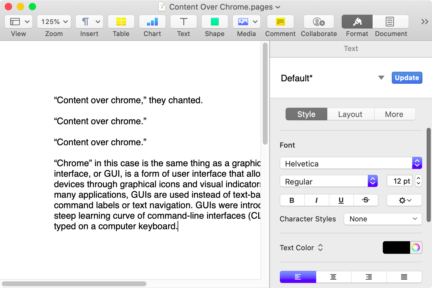
Here is that same document in a newer version of Pages running on MacOS Catalina, with the Yosemite-era design language that replaced the one that came before:
Click to expand (except on mobile).
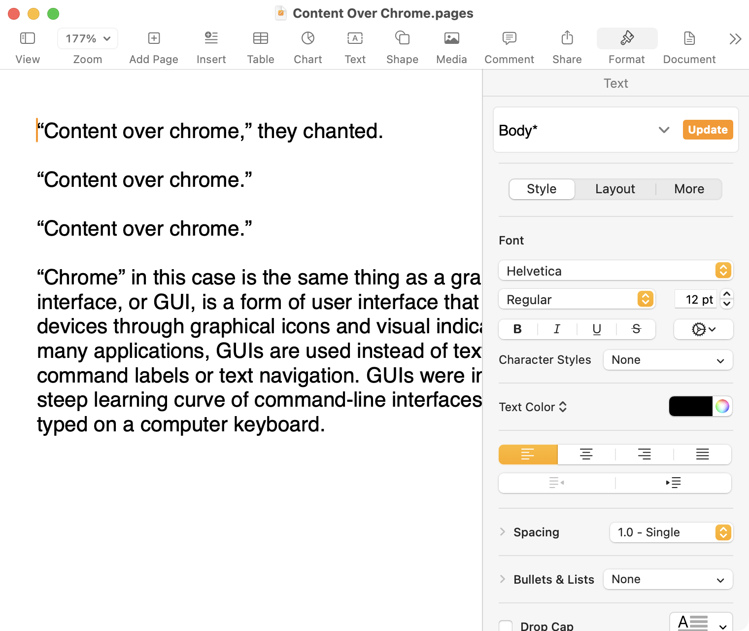
Here it is in the last version of Pages on MacOS Tahoe, using the design language introduced with Big Sur:
Click to expand (except on mobile).
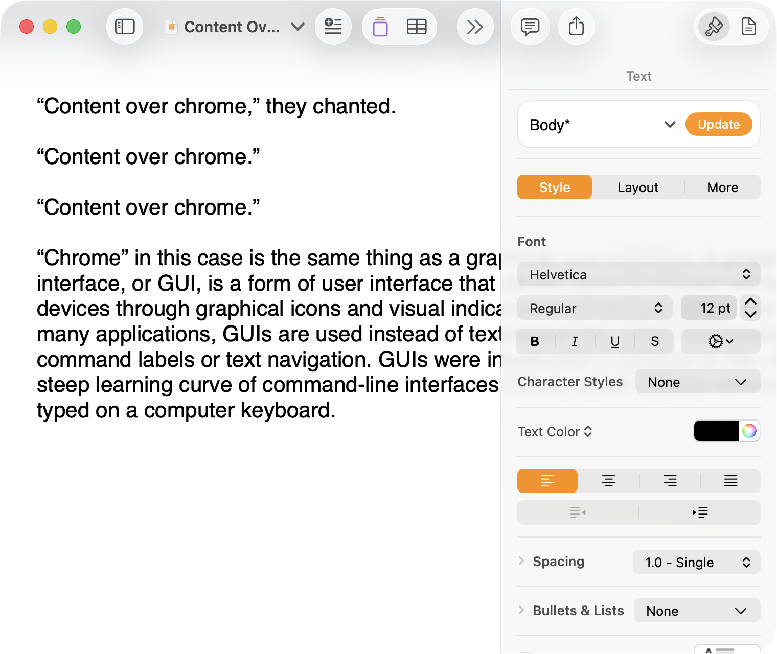
And, finally, the newest version of Pages on MacOS Tahoe using the current Liquid Glass visual design language:
Click to expand (except on mobile).
There are welcome improvements in newer versions of this comparison, like the introduction of the “Format” panel on the right-hand side, which makes better use of widescreen landscape-oriented displays, and allows for larger controls. While I admire the density of the Lion-era screenshot, the mini-sized controls in that formatting menu are harder to click.1
Overall, however, what Apple has done to Pages over this period of time is representative of a broader trend of minimizing the delineation of user interface elements from each other and the document itself. This is the only tool in the toolbox, and I am skeptical it achieves what Apple intends.
Compare again the two more recent screenshots against the ones that came before, and focus on the toolbar at the top of each. In the older two, there is a well-defined separation between the toolbar — the window itself — and the document. In the Big Sur visual language, however, the toolbar is the same bright white as the document. By Tahoe and the Liquid Glass language, there is barely a distinction; the buttons simply float over the document. And, bizarrely, that degrades further with the “Reduce Transparency” accessibility preference enabled:
Click to expand (except on mobile).
(Also, no, your eyes do not deceive you: the icons in the drop cap menu, barely visible in the lower-right, are indeed pixellated.)
For me, this means a constant distraction from my document because the whole window has a similar visual language. As the toolbar and its buttons become one with the document, they lose their ability to fade into the background. In the two older examples, the contrast of the well-defined toolbar allows me to treat them as an entirely separate thing I do not need to pay attention to.
This is further justified by the lower contrast within those two older toolbars. In Lion, the grey background and moderately saturated colours are a quiet reminder of tools that are available without them being intrusive. The mix of shapes is a sufficient differentiator, something Apple threw away in the following screenshot. By making all the buttons literal and with the same bright background, the toolbar becomes a little more distracting — but at least it does not blend into the document. Without the context of the previous screenshot, the colours of each icon seem almost random, and I find the yellow-on-white “Table” button difficult to distinguish at a glance from the black-on-yellow-on-white “Comment” button.
The Big Sur-era design language is, frankly, an atrocious regression. The heterogeneous shapes may have returned, but in the form of monochromatic medium-grey icons set against a uniform white background. The icons are not bad, per se — though putting “Add Page” and “Insert” next to each other in this default toolbar layout, both represented by a plus sign, is a little confusing. But I will bet you would not guess that some of these are buttons, while others are pop-up buttons with a submenu.
Finally, there is Liquid Glass which, in its default form, has more contrast than the previous example; with “Reduce Transparency” enabled, which is how I use MacOS, it has even less. The buttons themselves have a greater amount of internal contrast with bigger, darker grey icons on a white background. This is preferential within the context of the toolbar compared to the thin, small, and low-contrast buttons in the past example, but it also means this toolbar has similar contrast to the document itself.
I would not go so far as to argue that Pages ’09 has a perfect user interface and that everything since has been a regression. The average colours used for the icon fill in both older toolbars generally fails accessibility contrast checks which, remarkably, the Big Sur design will pass. The icons in Pages ’09 rely on dark outlines and unique shapes to have sufficient contrast with the toolbar background. However, Apple has since discarded most variables it could change to design these interfaces. Every button contains an icon of a single uniform colour, within barely defined holding containers of the same shape, and without text labels by default.
This monochromatic look means any splash of colour is distracting. The yellow accent used in Pages is garish — though, thankfully, something that can mostly be mitigated by changing the Theme Colour in System Settings, under Appearance. (Unfortunately, the yellow background remains on the “Update” button in the most recent version of Pages regardless of the system accent colour.) But perhaps you also noticed the purple icon in the Liquid Glass screenshot above. Here is the full toolbar:
Click to expand (except on mobile).
Those purple icons signify features that are part of Apple Creator Studio, a paid subscription to Pages and other applications that allows you to — in the order they are presented above — generate an image, artificially boost the resolution of an image, and access a stock image library. If you would like to insert one of your own images into your Pages document, that feature has been moved to the paperclip icon. Yes, it is a menu and not a button, despite lacking the disclosure triangle of the zoom menu right beside it, and it also reminds you about the “Content Hub” and “Generate Image” features. In Pages under Lion, colour was used in the icons to help guide the user as they complete a task — click the green thing to add a shape; click the darker yellow thing to add a table. Colour is not being used in the newer version to signify these are A.I. features, as the “Writing Tools” icon remains dark grey. In this version, the coloured icons are there to guide the user to premium add-ons regardless of whether they are currently paying for them.
I decided to focus on Pages for this comparison because it has lived so many different lives in MacOS. However, it is perhaps an imperfect representation for the rest of the system. Across Mac OS X Lion, for example, the toolbars of first-party applications like Finder and Preview almost exclusively use monochromatic icons. This has been true since Mac OS X Leopard, which also introduced barely differentiated folder icons. Some toolbars in Tiger, introduced two years prior, featured icons inside uniform capsule shapes. These were questionable ideas at the time, but they still retained defining characteristics. The capsules, for example, may have had a uniform shape, but contained within were full-colour icons. Most importantly, they were all clearly controls that were differentiated from the document.
Perhaps Apple has some user studies that suggest otherwise, but I cannot see how dialling back the lines between interface and document is supposed to be beneficial for the user. It does not, in my use, result in less distraction while I am working in these apps. In fact, it often does the opposite. I do not think the prescription is rolling back to a decade-old design language. However, I think Apple should consider exploring the wealth of variables it can change to differentiate tools within toolbars, and to more clearly delineate window chrome from document.
These screenshots are a bit limited as, to capture a high-resolution interface, I switched my mid-2012 MacBook Air to a 720 × 450 display output, which shrank the available space for Pages in the Lion and Catalina screenshots. ↥︎
[Beginning in iOS 18 and iPadOS 18] People can customize the appearance of their app icons to be light, dark, or tinted. You can create your own variations to ensure that each one looks exactly the way you way you want. See Apple Design Resources for icon templates.
Design your dark and tinted icons to feel at home next to system app icons and widgets. You can preserve the color palette of your default icon, but be mindful that dark icons are more subdued, and tinted icons are even more so. A great app icon is visible, legible, and recognizable, even with a different tint and background.
Apple’s announcement of “dark mode” icons has me thinking about how I would approach adapting “light mode” icons for dark mode. I grabbed 12 icons we made at Parakeet for our clients to illustrate some ways of going about it.
I appreciated this deep exploration of different techniques for adapting alternate icon appearances. Obviously, two days into the first preview build of a new operating system is not the best time to adjudicate its updates. But I think it is safe to say a quality app from a developer that cares about design will want to supply a specific dark mode icon instead of relying upon the system-generated one. Any icon with more detail than a glyph on a background will benefit.
Also, now that there are two distinct appearances, I also think it would be great if icons which are very dark also had lighter alternates, where appropriate.
 Login
Login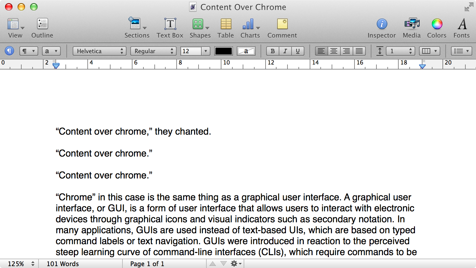
