The new Meta AI desktop app is version 1.0 beta at launch and weighs just 16MB once installed.
Based on initial inspection, it runs natively on Apple silicon Macs with macOS 15 or later, using an AppKit and SwiftUI shell with WebKit for richer chat content. In other words, this is not an Electron app or a repackaged iPad release.
Meta’s other major Mac app is WhatsApp, and it comes in at over 650 MB (and over a gigabyte on Windows). Its iOS apps are no better: Instagram is 605 MB, Facebook is 491 MB, and even Threads is over 200 MB. I do not understand why since virtually everything displayed in these apps is served remotely.
If you cannot get enough squircle talk, Michael Tsai has a whole roundup of different takes, some of which you may not have seen already.
Here is another thing: robbing icons of a variable for creative excellence and flexibility is just another form of context collapse. You know how Instagram and YouTube are host to professionals and amateurs alike? There are benefits to creating an impression of similar legitimacy, but the rigidity of social media platforms’ formats also collapses the difference between legitimate information and absolute nonsense.
Losing some of the artistry in an icon makes it more difficult to distinguish between legitimate and well-crafted Mac apps, and everything else. It is not a perfect proxy, to be sure, and there are some very nice squircle icons. But it is nevertheless an unfortunate change that makes apps of varying levels of quality look more similar.
With last year’s release of MacOS 26 (Tahoe), Apple made a mess of app icons. In the first betas of MacOS 27 (Golden Gate), however, there are signs of a turnaround. We’re urging Apple to continue making improvements, by restoring the ability for MacOS app icons to have distinct shapes.
Kafasis reignited my simmering frustration with the mandated squircle in MacOS. My Dock contains three of the apps shown in the collection in this post: MarsEdit, NetNewsWire, and Sketch. I like their current more-uniform icons fine enough, but they are less distinguished than the ones these applications used to have.
The shape of apps is a squircle. And it has been proven to work for everyone. Companies can use their logo as an app icon. Designers can create something specifically for the platform. And both of these get to look like an app. Whether people consider the squircle a container or a canvas, this uniform appearance communicates its function: a squircle represents an app, just like how a piece of paper represents a digital document, or a folder represents, well, a folder.
Semantically, there’s something really beautiful about that. As an icon designer, I appreciate that different types of things have visual distinction.
Mantia touches on all the pragmatic reasons to unify the shape of icons in an operating system, all of which I have considered, and then drops the above paragraphs — and things started to make more sense to me. This is a different way to think about it. This is not a situation where a cleaner looks like a zesty beverage with toxic consequences. The shared general function of these icons does help communicate something and makes them less ambiguous in that sense.
But a broad category of functionality is only part of the story of an icon and — with respect to Mantia’s long and illustrious history of work in this area, and that of co-Parakeeter Luka Grafera — taking away a difference of shape also limits what an icon can communicate. It may not be a cleaning product that looks and is packaged like juice, but imagine if every consumable liquid was in identical bottles with only a different label. You might go for something refreshing after a workout and end up drinking soup. Sure, you can argue the label for a beverage should not look similar to the one for soup, but the two would be far easier to distinguish if they were not in the same package.
I still think constraining designers to a singular shape, while more clearly defining specific objects as apps, has made it harder to distinguish between them, particularly when combined with the glassy and contrast-killing layer effects of Tahoe. Happily, though not retreating on the squircle, the shapes within icons in MacOS Golden Gate are at least more clearly defined.
In a WWDC 2011 session, Dan Schimpf explained some of the goals of the refreshed design for Aqua in Mac OS X Lion were “meant to focus the user attention on the active window content”. This sentiment was echoed by John Siracusa in his review of Lion for Ars Technica:
Apple says that its goal with the Lion user interface was to highlight content by de-emphasizing the surrounding user interface elements.
[…] a fresh modern look where controls are clearer, smarter and easier to understand, and streamlined toolbars put the focus on your content without compromising functionality.
Then, when it revealed the Big Sur redesign in 2020, it explained:
The entire experience feels more focused, fresh, and familiar, reducing visual complexity and bringing users’ content front and centre.
And you will never guess what it promised in 2025 with the announcement of MacOS Tahoe and Liquid Glass, as introduced by Alan Dye:
Our goal is a beautiful new design that brings joy and delight to every user experience. One that’s more personal, and puts greater focus on your content — all while still feeling instantly familiar.
It is not just Apple, either. Here is Microsoft’s Jensen Harris at Build 2011 describing a key goal for the company’s then-new Metro design language:
Metro-style apps have room to breathe. They’re not about the chrome, they’re about the content. […] For years, Windows was always about adding stuff. We added bars, and panes, and doodads, and widgets, and gadgets, and bars — and stuff everywhere. And that’s how we defined our U.I., based on what new widgets we added. Now, we’ve receded into the background, and the app is sitting out there on the stage.
And later, as Microsoft rolled out app updates with its Fluent Design language, it described them in familiar terms:
With the updated OneDrive, your content takes center stage. The improved visual design reduces clutter and distractions, allowing you to focus on what’s important – your content.
This is a laudable goal if the opposite is, I assume, increasing the amount of clutter in user interfaces and making them more distracting. Nobody wants that. Then again, while the objective may be quite reasonable, there are surely different ways of achieving it — but Apple has embraced a single strategy: make the interface blend into the document. (I will be focusing on MacOS here as it is the platform I am most familiar with.)
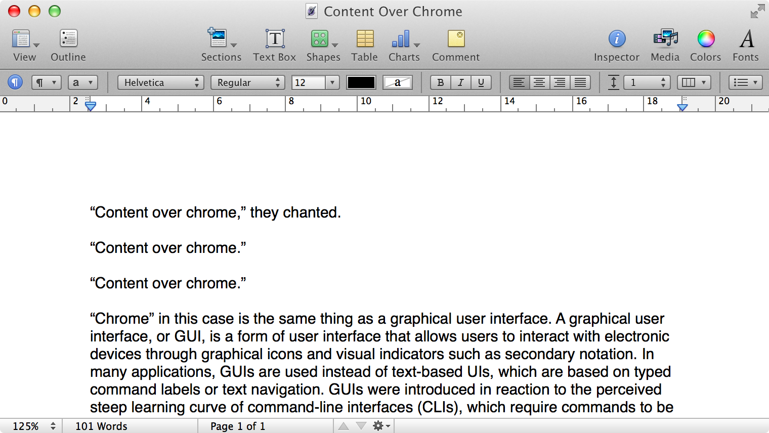
Here is what a Pages document looks like running under Mac OS X Lion:
Click to expand (except on mobile).
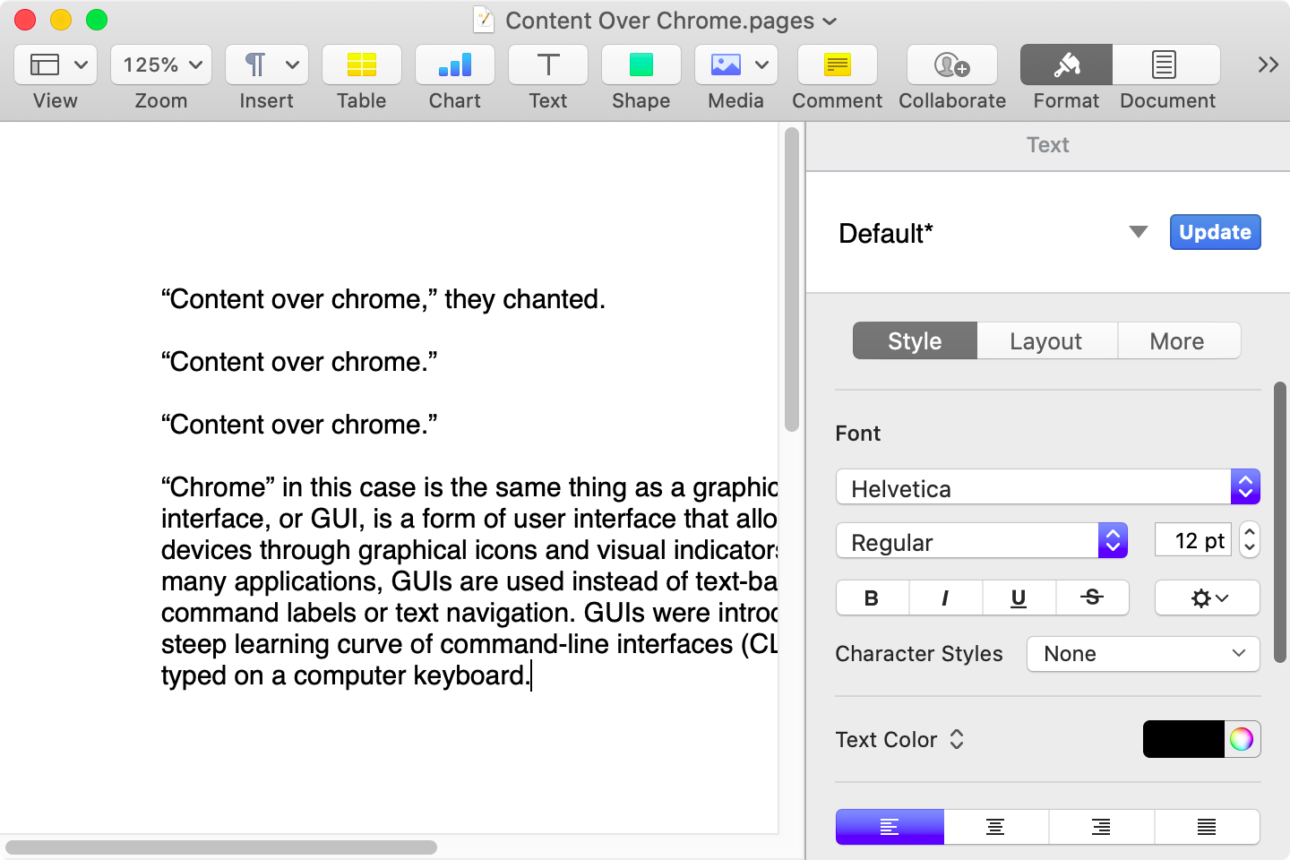
Here is that same document in a newer version of Pages running on MacOS Catalina, with the Yosemite-era design language that replaced the one that came before:
Click to expand (except on mobile).
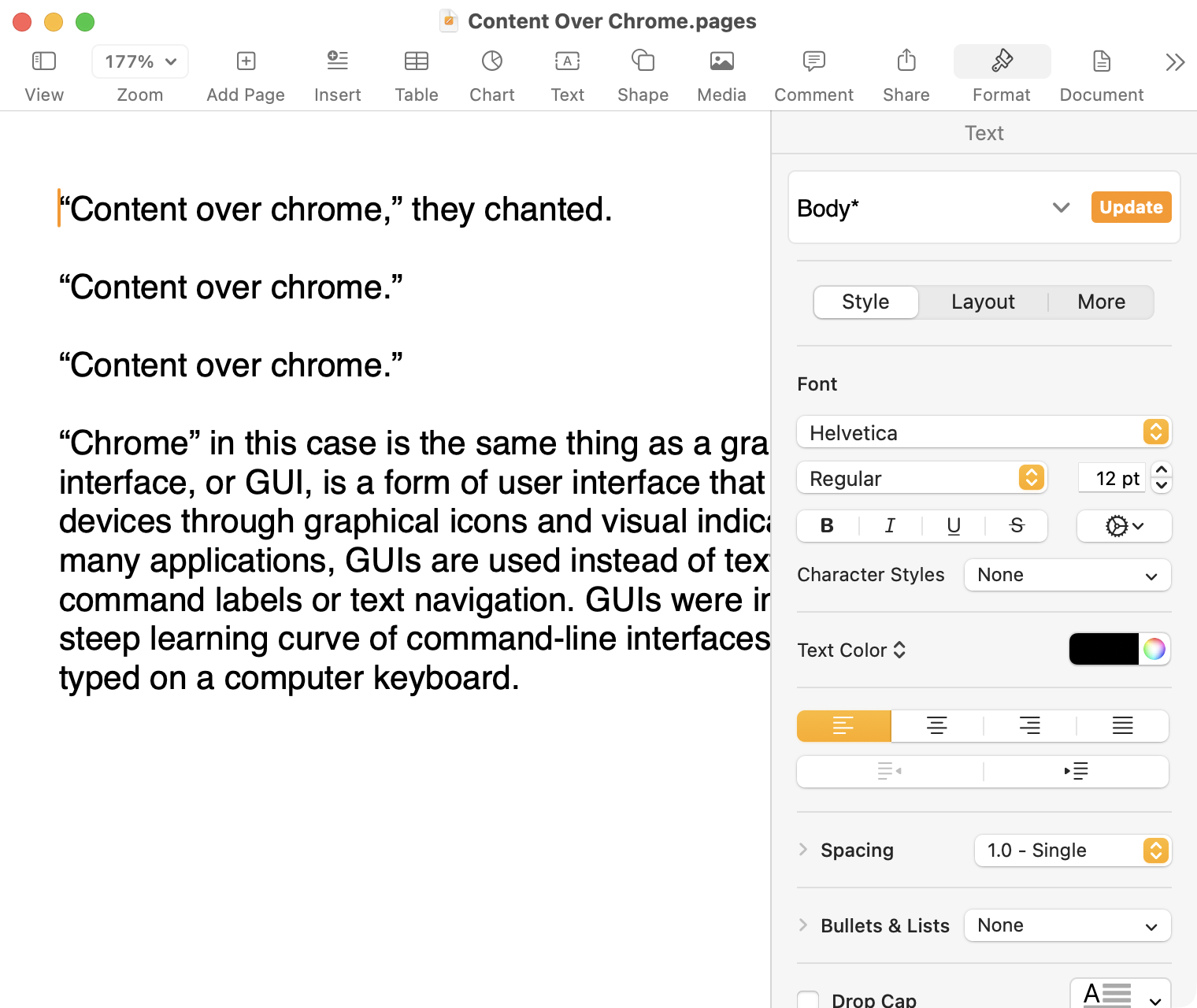
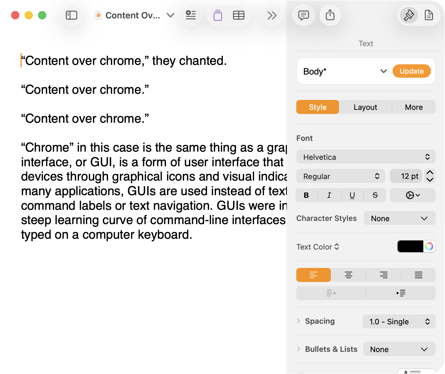
Here it is in the last version of Pages on MacOS Tahoe, using the design language introduced with Big Sur:
Click to expand (except on mobile).
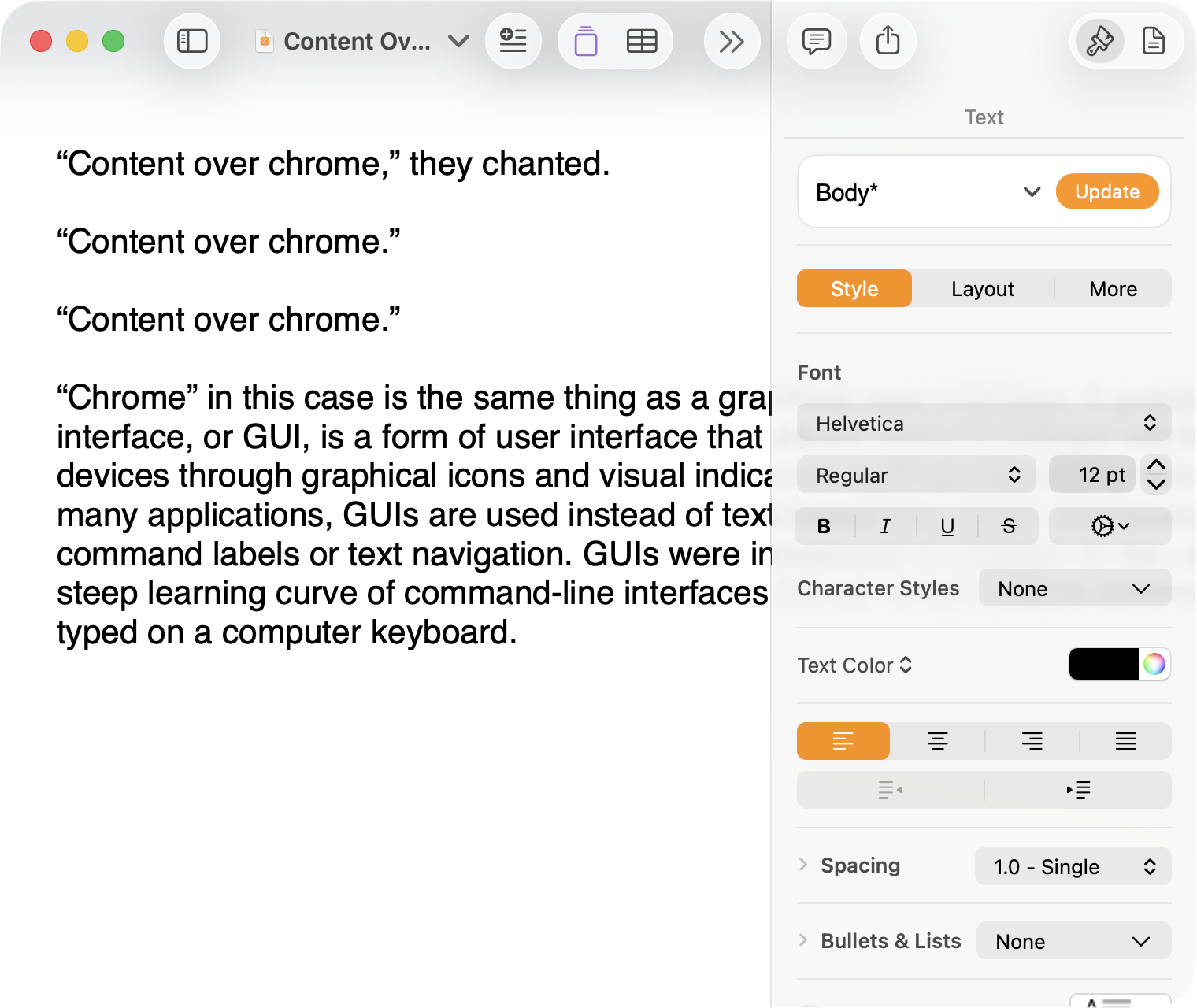
And, finally, the newest version of Pages on MacOS Tahoe using the current Liquid Glass visual design language:
Click to expand (except on mobile).
There are welcome improvements in newer versions of this comparison, like the introduction of the “Format” panel on the right-hand side, which makes better use of widescreen landscape-oriented displays, and allows for larger controls. While I admire the density of the Lion-era screenshot, the mini-sized controls in that formatting menu are harder to click.1
Overall, however, what Apple has done to Pages over this period of time is representative of a broader trend of minimizing the delineation of user interface elements from each other and the document itself. This is the only tool in the toolbox, and I am skeptical it achieves what Apple intends.
Compare again the two more recent screenshots against the ones that came before, and focus on the toolbar at the top of each. In the older two, there is a well-defined separation between the toolbar — the window itself — and the document. In the Big Sur visual language, however, the toolbar is the same bright white as the document. By Tahoe and the Liquid Glass language, there is barely a distinction; the buttons simply float over the document. And, bizarrely, that degrades further with the “Reduce Transparency” accessibility preference enabled:
Click to expand (except on mobile).
(Also, no, your eyes do not deceive you: the icons in the drop cap menu, barely visible in the lower-right, are indeed pixellated.)
For me, this means a constant distraction from my document because the whole window has a similar visual language. As the toolbar and its buttons become one with the document, they lose their ability to fade into the background. In the two older examples, the contrast of the well-defined toolbar allows me to treat them as an entirely separate thing I do not need to pay attention to.
This is further justified by the lower contrast within those two older toolbars. In Lion, the grey background and moderately saturated colours are a quiet reminder of tools that are available without them being intrusive. The mix of shapes is a sufficient differentiator, something Apple threw away in the following screenshot. By making all the buttons literal and with the same bright background, the toolbar becomes a little more distracting — but at least it does not blend into the document. Without the context of the previous screenshot, the colours of each icon seem almost random, and I find the yellow-on-white “Table” button difficult to distinguish at a glance from the black-on-yellow-on-white “Comment” button.
The Big Sur-era design language is, frankly, an atrocious regression. The heterogeneous shapes may have returned, but in the form of monochromatic medium-grey icons set against a uniform white background. The icons are not bad, per se — though putting “Add Page” and “Insert” next to each other in this default toolbar layout, both represented by a plus sign, is a little confusing. But I will bet you would not guess that some of these are buttons, while others are pop-up buttons with a submenu.
Finally, there is Liquid Glass which, in its default form, has more contrast than the previous example; with “Reduce Transparency” enabled, which is how I use MacOS, it has even less. The buttons themselves have a greater amount of internal contrast with bigger, darker grey icons on a white background. This is preferential within the context of the toolbar compared to the thin, small, and low-contrast buttons in the past example, but it also means this toolbar has similar contrast to the document itself.
I would not go so far as to argue that Pages ’09 has a perfect user interface and that everything since has been a regression. The average colours used for the icon fill in both older toolbars generally fails accessibility contrast checks which, remarkably, the Big Sur design will pass. The icons in Pages ’09 rely on dark outlines and unique shapes to have sufficient contrast with the toolbar background. However, Apple has since discarded most variables it could change to design these interfaces. Every button contains an icon of a single uniform colour, within barely defined holding containers of the same shape, and without text labels by default.
This monochromatic look means any splash of colour is distracting. The yellow accent used in Pages is garish — though, thankfully, something that can mostly be mitigated by changing the Theme Colour in System Settings, under Appearance. (Unfortunately, the yellow background remains on the “Update” button in the most recent version of Pages regardless of the system accent colour.) But perhaps you also noticed the purple icon in the Liquid Glass screenshot above. Here is the full toolbar:
Click to expand (except on mobile).
Those purple icons signify features that are part of Apple Creator Studio, a paid subscription to Pages and other applications that allows you to — in the order they are presented above — generate an image, artificially boost the resolution of an image, and access a stock image library. If you would like to insert one of your own images into your Pages document, that feature has been moved to the paperclip icon. Yes, it is a menu and not a button, despite lacking the disclosure triangle of the zoom menu right beside it, and it also reminds you about the “Content Hub” and “Generate Image” features. In Pages under Lion, colour was used in the icons to help guide the user as they complete a task — click the green thing to add a shape; click the darker yellow thing to add a table. Colour is not being used in the newer version to signify these are A.I. features, as the “Writing Tools” icon remains dark grey. In this version, the coloured icons are there to guide the user to premium add-ons regardless of whether they are currently paying for them.
I decided to focus on Pages for this comparison because it has lived so many different lives in MacOS. However, it is perhaps an imperfect representation for the rest of the system. Across Mac OS X Lion, for example, the toolbars of first-party applications like Finder and Preview almost exclusively use monochromatic icons. This has been true since Mac OS X Leopard, which also introduced barely differentiated folder icons. Some toolbars in Tiger, introduced two years prior, featured icons inside uniform capsule shapes. These were questionable ideas at the time, but they still retained defining characteristics. The capsules, for example, may have had a uniform shape, but contained within were full-colour icons. Most importantly, they were all clearly controls that were differentiated from the document.
Perhaps Apple has some user studies that suggest otherwise, but I cannot see how dialling back the lines between interface and document is supposed to be beneficial for the user. It does not, in my use, result in less distraction while I am working in these apps. In fact, it often does the opposite. I do not think the prescription is rolling back to a decade-old design language. However, I think Apple should consider exploring the wealth of variables it can change to differentiate tools within toolbars, and to more clearly delineate window chrome from document.
These screenshots are a bit limited as, to capture a high-resolution interface, I switched my mid-2012 MacBook Air to a 720 × 450 display output, which shrank the available space for Pages in the Lion and Catalina screenshots. ↥︎
Over those 11 years, governments have come and gone, my grandchildren have grown up and one is now at university, we survived Covid, lost QuickTime and 32-bit code, and now use Apple silicon Macs. But one thing has remained unchanged through all of that, the Finder column width bug.
Maybe this is the year this bug will bubble up to the top of an intern’s to-fix list. As a dedicated user of the column view, I would not miss it.
Apple is a famously tight-knit business. Its press releases and media conferences routinely drum the integration of hardware, software, and services as something only Apple is capable of doing. So it sticks out when features feel like they were developed by people who do not know what another part of the company is doing. This happened to me twice in the past week.
Several years ago, Apple added a very nice quality-of-life improvement to the Mac operating system: software installers began offering to delete themselves after they had done their job. This was a good idea.
In the ensuing years, Apple made some other changes to MacOS in an effort to — it says — improve privacy and security. One of the new rules it imposed was requiring the user to grant apps specific permission to access certain folders; another was a requirement to allow one app to modify or delete another.
And, so, when I installed an application earlier this month, I was shown an out-of-context dialog at the end of the process asking for access to my Downloads folder. I granted it. Then I got a notification that the Installer app was blocked from modifying or deleting another file. To change it, I had to open System Settings, toggle the switch, enter my password, and then I was prompted to restart the Installer application — but it seemed to delete itself just fine without my doing so.
This is a built-in feature, triggered by where the installer has been downloaded, using an Apple-provided installation packaging system.1 But it is stymied by a different set of system rules and unexpected permissions requests.
Another oddity is in Apple’s two-factor authentication system. Because Apple controls so much about its platforms, authentication codes are delivered through a system prompt on trusted devices. Preceding the code is a notification informing the user their “Apple Account is being used to sign in”, and it includes a map of where that is.
This map is geolocated based on the device’s IP address, which can be inaccurate for many reasons — something Apple discloses in its documentation:
This location is based on the new device’s IP address and might reflect the network that it’s connected to, rather than the exact physical location. If you know that you’re the person trying to sign in but don’t recognize the location, you can still tap Allow and view the verification code.
It turns out one of the reasons the network might think you are located somewhere other than where you are is because you may be using iCloud Private Relay. Even if you have set it to “maintain general location”, it can sometimes be incredibly inaccurate. I was alarmed to see a recent attempt from Toronto when I was trying to sign into iCloud at home in Calgary — a difference of over 3,000 kilometres.
The map gives me an impression of precision and security. But if it is made less accurate in part because of a feature Apple created and markets, it is misleading and — at times — a cause of momentary anxiety.
What is more, Safari supports automatically filling authentication codes delivered by text message. Apple’s own codes, though, cannot be automatically filled.
These are small things — barely worth the bug report. They also show how features introduced one year are subverted by those added later, almost like nobody is keeping track of all of the different capabilities in Apple’s platforms. I am sure there are more examples; these are just the ones which happened in the past week, and which I have been thinking about. They expose little cracks in what is supposed to be a tight, coherent package of software.
Thanks to Keir Ansell for tracking down this documentation for me. ↥︎
Prior to Mac OS X, Adobe Acrobat, both in its free viewer form and a paid-for Pro version, were the de facto standard for reading, printing and working with PDF documents on the Mac. The Preview app had originated in NeXTSTEP in 1989 as its image and PDF viewer, and was brought across to early versions of Mac OS X, where it has remained ever since.
The slow decline of Preview — and Mac PDF rendering in general — since MacOS Sierra is one of the more heartbreaking products of Apple’s annual software churn cycle. To be entirely fair, many of the worst bugs have been fixed, but some remain: sometimes, highlights and notes stop working; search is a mess; copying text is unreliable.
Unfortunately, the apps which render PDF files the most predictably and consistently are Adobe Acrobat and Reader. Both became hideous Electron Chromium-based apps at some point and, so, are gigantic packages which behave nothing like Mac software. It is all pretty disappointing.
Update: A Hacker News commenter rightly pointed out that Acrobat and Reader are not truly Electron apps, and are instead Chromium-based apps. That is to say both are generic-brand shitty instead of the name-brand stuff.

 Login
Login